Wednesday, 20 November 2013

Photoshoot (changes made)

Why is it important to carry out a photoshoot, especially when creating a digipak and magazine advert?

A photo shoot is a vital process when creating a digipak and magazine as this provides the target audience with relevant pictures of the artist in which they can connect with, maintaining their interest of the artist as they are in the public eye for audience to see. Lack of images when creating such ancillaries could arguably effect their ability to appeal to the target audience, as they become uninterested with the artist for they have nothing to relate to; in order to first listen to the CD within the digipak, or read the magazine, the target audience are initially drawn by its visual appeal and therefore, a photo shoot is vital during production in order for consumption. Furthermore, if we were to use pre-existing photographs of the artist rather than doing a photo shoot, this increases the risk of not capturing the current image of the artist as to what their current style is etc, thus disinteresting the audience as the artist becomes too familiar; they are bombarded with the same photographs of the artist and therefore have nothing to maintain their interest.

For Example:


Here a photograph taken from a photoshoot that Rihanna did in 2005. Her image appears very natural, minimalistic and conventional for a young female pop artist; characteristics that suggest what she is like as a person and therefore provides her target audience with a representation that they can connect with in order to build a relationship. This in turn encourages them to maintain such interest.


However, this photograph was taken from a photoshoot of Rihanna in 2013, a much contrasting photoshoot when compared to her previous one in 2005. Her head is shaven, she has several tattoos and she appears to be smoking; a much more rebellious representation. However, the target audience are still provided with the indication of what she is like as a person and therefore by doing photoshoots throughout her career, she is keeping her fans up to date as to what she is like, rather than continuing to release the same picture from 2005 and appear boring. This is an example of how photoshoots provide an effective representation of what the artist is like, and when and how they are changing.


What images did you take and why? 

We conducted the photoshoot in the forest for we felt this was effective in creating the representation of the artist as being natural and down to earth; conventional to the genre and therefore appealing to our target audience. Furthermore, it is a relevant location to our music video and therefore the audience can associate the photoshoot with the music video, reinforcing the coherence of her image. Below are some of the pictures taken for the photoshoot.


Where will your images be used and why? 

These pictures taken from the photoshoot we carried out will be used in the making of both our digipak and the magazine advert. Digipaks typically provide informations on the artist and therefore photos are effective in representing the artist, as the visual encourages the audience to interpret them. For example, each photograph is taken in a forest and therefore the nature in the photograph is an addition to the representation of the artist as it signifies her natural image. Therefore not only will the written aspect of the digipak provide information but so will the pictures. Furthermore, the pictures will also be used in the creation of out magazine advert. Magazines are a mass method of advertisement and therefore provides the ideal solution of creating awareness of the artist. In which case, the photo must be effective in portraying the representation of the artist, identical to who she actually is in order to increase genuine appeal. 


How are your images conventional to your genre?


Here are two examples of magazine adverts based on indie artists; both holding a guitar. Previous to carrying out the photoshoot we decided that we must include some pictures of the artist holding a guitar as this is a convention of the indie genre for it represents them as talented rather than an artist who is deceitful in their talent and are rather constructed for consumption. Therefore when doing the photoshoot we took several of the artist holding the guitar in order to create such representation and increasing the appeal in which our target audience were to feel. It also allows the target audience to recognise such talent in order to be able to relate to it through similar talents and interests of their own which encourages them to relate to the artist, feeling closer to them and building a relationship.


Furthermore, her is an example of another magazine advert for Florence and the Machine, another Indie artist. Similarly to our own photoshoot, this advert has incorporated the theme of nature to represent the artist. The suggested qualities of being natural and down to earth are often signified through nature and therefore conventional to the genre; for these are the qualities deemed appealing to the target audience.Therefore, when creating our ancillary products, such theme will be portrayed in order to conform to convention.


Include one example of how you photoshop to create a conventional product


When editing the photographs from the photoshoot in order to be used for the digipak, we used photoshop in order to soften the colours as we felt the brightness of the picture connoted the pop genre. By softening the photo, we felt it conformed to the indie genre increasingly as it became more subtle and natural. Furthermore, we edited the nature around the artist to stand out and therefore reinforce the representation of her being natural, as well as ensuring her lipstick remained prominent as this is also a convention of the indie genre.


Magazine Advert Reflection (changes made)


In order for our target audience to be aware of our artist and her music, the promotion of both are vital in making her successful, for without it there will be lack of awareness. Therefore, we shall first design our initial ideas in terms of the content and effect our magazine advert will consist of so that we can progressively create out final idea on Photoshop. Below, are the stages of design and research we have done in order to create our final magazine advert.
An idea of our magazine advert


The first stage carried out, was the group meeting in which we all designed and drew our own interpretation of what our magazine advert would look like in order to fairly compromise as to what we liked and disliked of each others. Here, is my first initial drawing of our magazine advert.


What are your ideas and inspirations behind your paper design?

As our artist is particularly unknown, I felt that it was vital in establishing an effective and accurate artist representation, so that the appeal of the advert was tailored according to our target audience. Therefore, the setting of the advert was designed to be in a field, typically for 2 main reasons; the first being the role that nature plays in the indie genre, as it typically represents the artist as down to earth and therefore, the target audience are able to effectively relate to the artist, a quality in which they find appealing. The second being, the a field itself is symbolic of liberation, for there are no obstacles or interruptions. This is further symbolic of the indie genre, for it subverts the mainstream conventions, an example of liberation in terms of taste, what people like and find appealing. Additionally, the artists' name is Daisy, also a flower commonly found in a field and therefore this reinforces the idea that the artist is natural, rather than falsely constructed in order for consumption and therefore the field is drawn as evidently filled with daisies.Therefore, I felt a field was successful in representing the artist as a down to earth, conventional indie artist, a clear coherent representation the audience can relate to. Furthermore, an image of the artist in the field will be present. Although originally designed as if walking with her back toward to audience, I later felt that this was isolating the audience and therefore decided to change this and have it so that the artist was facing forward, resulting in the engagement between both artist and audience in order for them to become familiar with her. This will also convey her playing the guitar more effectively and therefore, will provide the audience with a short representation of the artist in which they can relate to through a similar interest or talent in terms of instrument playing. This is a typical convention of the indie genre too, so this reinforces that the artist is in fact indie. Moreover, I decided to put minimal but informative information on the advert so that the audience were engaged but not overpowered with information. I included the artist's name in order to make the advert clear as to who it was about; a selection of her singles so that they were encouraged to listen to them in order to stimulate interest in the artist; and finally, I also included the statement 'out now', to inform the target audience that such music is available for them now, creating a sense of immediacy as well as exclusiveness. Each piece of information was designed to be in it's own box to draw attention to it, rather than having it merged with the background and therefore prone to being overlooked.


How did you use your research into magazine adverts to start planning your own?

Previous to designing my own magazine advert, I research into pre-existing adverts that consisted of other Indie artists; however I found that not many Indie artists had magazine adverts available to analysis, which could arguably be a result of the typical indie artist representation in that they are not interested in promotion of image rather just focused on their music. When I did find relevant magazine adverts, there was minimal information, conveying their humbleness in that they are not 'showy' of what they have achieved nor does their target audience find such representation appealing, and therefore, they subvert this. However, when searching for magazine adverts for artists such as Beyonce or Rihanna, many were available because this gives their target audience an opportunity to relate to the artists in which otherwise, they would not be able to, as such artists are deemed 'extraordinary' rather than 'ordinary' and therefore hard to relate to. I decided to incorporate such method in my own magazine advert, in that additional information about the artist was not included in order for the representation to remain intended; the artist is natural, easy to relate to and not over the top. Furthermore, the adverts that I did come across were heavily focused on nature, evident in the post 'Magazine Advert Analysis', in which I found effective in representing the artist as nature has connotations that are easy for our target audience to relate to; simplicity, down to earth, liberation etc. As a result I decided to incorporate such motif in my own magazine advert to convey representation of the artist as being all these qualities.


How will this help you with creating it on Photoshop?

First of all, when going to create my magazine advert on Photoshop, I will need to take some pictures on the artist in order to have this evident in my advert, so that the audience can identify who she is and hopefully go on to relate to her. My previous research will assist me in the final design of my magazine advert as it has established the conventions of an indie representation which the target audience will find appealing. These include, a natural setting, image of the artist, evidence of additional instruments that can be played and the artist name.


Here is my individual attempt of a magazine advert for the promotion of the album release of our artist. However, the effectiveness of the advert is very weak for many reasons; the first being its lack of convention according to the indie genre. The artist herself appears very indie through her image as she is wearing eye liner, red lipstick and denim and therefore such image will be incorporated  in the final making of our magazine. However her surroundings are only black and white, colours often associated with rock and goth as they connote an eerie atmosphere and therefore will not appeal to the target audience. Therefore when creating our final magazine advert, we will incorporate more colour so that it is less dull and engages the target audience to look at it and become aware of the artist herself; ensuring that such increase of colour will conform to indie convention rather than pop. Contrastingly, the font used on the advert is very conventional as it is slightly playful and relevant to the song; for example, the word 'shoestrings' is written in a font that connotes the visual of a shoestring and therefore visually interprets the song. However, to increase the effect of the artist's image, a good idea would be to use the same font throughout the digipak so that the audience can relate such font with the artist, reinforcing the coherence of her image and therefore establishing a clear representation.

Conclusively, the changes need to be made are:


  1. The advert needs more colour so that is stands out. However, the source of colour must remain indie as this could confuse our target audience. For example, if we were to put florescent lights on the advert this would connote the dance genre and therefore our target audience will not find it appealing.
  2. The font must be coherent in style and therefore be the same throughout to establish a clear image in which the artist will be associated with.
  3. The album name was not included and therefore must be in the final advert as this promotes the rest of her tracks as well as the song of our music video. This encourages the audience to maintain an interest as they have several songs to listen to, not just one.


Final Group Magazine Advert:


Go to: Group Magazine Advert for the making of this advert


Monday, 18 November 2013

Digipak Analysis


1)    What is the purpose of a digipak?

A digipak is a type of packaging for CDs or DVDs, typically made from cardboard with an internal
plastic holder for one or more discs; often used for CD singles or special editions of CD albums.
Digipaks typically consist of 4 or 6 panels; front cover, back cover, CD holder and the remaining
panels being subjective to information on either the artist or the songs included.


2)    How is a digipak different to a CD album?

The top image is an example of a digipak whereas the bottom
example demonstrates what a typical CD album looks like.

Digipaks and CD albums differ in terms of how they are made, what they are made of and how they look in appearance. Digipaks are normally made from cardboard like material, giving it a much more rural effect and are arguably more environmentally than typical CD cases. However CD albums have been argues to be less vulnerable to wear and tear as they are made of plastic and therefore are less easily damaged. Aesthetically, both differ. Digipaks typically have more amount of panels ranging from 4 to a possible 8. In turn, they supply the consumer with much more information on the artist or the songs whereas a CD album normally has 4 panels when supplying one CD; a front cover, a back cover, a CD holder and the back of the front cover. CD albums are effective for protecting the CD effectively but digipaks supply more than just a CD as it provides background information too.

Task 1:

Analyse the following digipak. Ensure that your analysis is detailed and that you have included excellent examples to support the points that you have made. Also relate back to the music conventions and the target audience.


·                     Representation of music artist

The representation of the music artist 'Jack Johnson' conforms to the conventions of a typical Indie artist. On the front cover of his able, there is a silohette of a figure assumed to be him holding a guitar, as well as another panel conveying himself with a guitar again; central to the photograph to emphasise. By evidently displaying that the artist can play guitar suggests that he is pure in his talent, also providing the target audience with a short representation of him as it tells the target audience of his talent and therefore they have something in which they can relate to. Playing guitar is deemed conventional to an indie artist as presents to artist as down to earth, it is a quality in which others can relate to as many people have an interest/talent in guitar playing. In turn, this digipak will appeal to his target audience as they will be able to recognise and identify that the artist has similar interests to themselves and therefore they will feel closer to him.


Within the digipak, there is only one photograph of the artist himself, an image which does not appear clear in revealing his identity as the audience can only see a partial view of his face and some of his hand. This represents to artist as not being focused on his image and rather focused on his music as he makes this the main focus through lack of images of himself. This representation is highly typical of the indie genre as artists within such genre are presented subverting mainstream images by focusing on their music as a opposed to the brand of clothing they are wearing. Arguably, the lack of visual exposure regarding the artist's appearance may cause the target audience to become uninterested as they have little to relate to; however, because Jack Johnson is an indie artist, this follows generic conventions so therefore the target audience are prone to not viewing such aspect as unappealing and in turn, find such representation attractive rather than boring.


·                     Colours

The digipak appears to have a yellow motif as well as areas in both black and white. However it is mainly yellow, with this particular colour having very positive connotations such as sunlight, optimism, and happiness and therefore sub-consciously the target audience are prone to feeling positive as well. The connotations of the general motif of this digipak is arguably ambiguous in its intended effect on others, whether it be to indicate the personal qualities of the artist and therefore the target audience are given a short representation to relate to. Or maybe suggestive of the type of songs the digipak includes and therefore the target audience get a feel as to what the album will consist of? Conclusively, the motif provides the audience with a suggested representation of the album as a whole and therefore will appeal to them according to whether such representation is what they are looking for.


The contrast of black and white have been used against the yellow motif in order to achieve simplicity as well as effectiveness. If the artist would have chosen another 2 bright colours the digipak may have been mistaken for a pop artist as such appearance would conform to the pop generic conventions. However, by choosing two simple colours, the artist has effectively created a successful indie digipak in which the target audience can easily recognise and therefore find appealing. Such colours fit in with the artist representation as well as they fit in with the nature motif. Black and white could connote night an day, light and shade etc and therefore are suitable to the digipak's appearance.


·                     Design/layout

The design of each panel has an evident reference to nature in which this portrays the artist as very down to earth and simplistic, rather than over edited in construction of both digipak and image. Therefore the target audience are able to easily relate to the artist through his representation as he appears very ordinary. Regarding proportions, the allusion to nature is very large compared to the other content in each panel which emphasises that artist's simplicity and down to earth qualities. In particular, the allusion to nature is often portrayed by a tree or leaf, in which such figures are symbolic of liberation and independence, relating to the generic conventions. Indie is a genre is which manifested as a reaction to the mainstream genres such as pop as individuals felt that such genres lacked opportunity to relate to the artist or material they were creating because it lack relevancy to their own lives. Therefore, the trees seen on the digipak could be representative of the artist 'branching out' away from such mainstream conventions and rather remaining 'natural' according to his own image.


Furthermore, the design of the digipak appears very 2D as it lacks variation in terms of the colours used and therefore the use of block colours reinforces the artist being simplistic in his image. Although simple, the use of block colours also indicate statement for the target audience have limited colour to focus on and therefore the colour that is used appears as a statement, reinforcing the connotations of each colours as discussed previous.


·                     Typography

Much like the majority of each of the panels, the typography conforms to the simple style evident. The font itself is clear so that it is easy for the target audience to read and recognise who the artist is. This is conventional to the indie genre as it is simple rather than an unfamiliar font that correlates with an unfamiliar lifestyle that an artist such as Beyonce has. It represents the artist according to who he is and therefore the audience can relate to him as he appears ordinary through his use of simple font. The colour of the font is also clear to read, for it is opposing to the yellow background and therefore easily readable; such quality allows the target audience to know which artist this digipak contains and therefore is more likely to appeal to them as it lacks confusion as a result of its bold visual. However, the size is very small which may cause many to question which artist it is, as they cannot clearly see through a lack of big font and image of the artist. On the other hand, indie artists are recognised as being understated rather than over the top so this particular choice in terms of design and layout conforms to the generic conventions which will appeal to the target audience.


·                     How does the digipak promote the music genre?

The clear motif of nature represents the artist as down to earth as this subverts the mainstream conventions. This gives the artist and digipak qualities that the target audience can relate to as they are familiar with such content and their connotations as a result of associative connections. As discussed before, the indie genre formed as a reaction to mainstream genres and therefore such allusion to nature emphasises to the target audience that such artist conforms to indie conventions as being down to earth and simplistic. In turn, this promotes the genre as the generic conventions are easily recognised and therefore the target audience can clearly identify the digipak is indie. This will appeal to the target audience for the representation of the artist and indie genre are consistent and coherent and therefore will specifically meet their demand.


Include a summary at the end of your blog to show how you will use your research to inform your planning and creating your own digipak for your own artist. 

From analysing the previous digipak, the content of each panel typically conforms to the indie conventions in which we also plan on including. This is because it makes the appearance of the digipak clearly indie so that the target audience can easily identify the digipak as being Indie related, encouraging them to look and listen to it. Here are the following attributes in which we plan to include in the creation of own digipak for our own artist, as well as the aspects that we feel we will change:


  • The motif of nature is effective in representing the artist as being easy to relate to, as the location is one that the target audience are familiar with. Furthermore, it's suggestive of their personality as being down to earth and simple, typical of the indie genre. As the genre is a reaction of mainstream genres, we wish to stay away from such conventions because this will not appeal to our target audience. Therefore it would be illogical to have the location of our digipak at a club, as this is not what our target audience find appealing and would more likely to be found in the hip hop genre. In which case, there will be evidence in our digipak of nature; possibly a daisy flower to reinforce the representation of innocence and natural through playing on the artist's name so not only do the audience understand her personality but also her name. This encourages them to remember her and therefore are more likely to maintain an interest in her.
The colours used in this digipak are simplistic, as there are only three main colours; yellow, black and white. They are all block colours as well which highlight the contrast as each one, further emphasising their connotations. This effectively suggests to the target audience the style in which both the music and artist adhere and therefore is successful in attracting the target audience for they know what to expect. Our research has influenced us to create a digipak that is consistent throughout each panel in regards to colours as this creates a theme in which can be representative of the artist and her track. To do this, we aim to focus on certain colours throughout our nature motif so that their connotations are highlighted to the target audience; green, which will be typically evident through fields and grass etc, to convey the artist's down to earth approach; yellow, typically conveyed by sunlight as light is a motif throughout our music video and therefore this creates a link; and floral pattern, shown on the artist's costume as this will reinforce her indie style in which her target audience can relate to and copy in order to feel increasingly similar to her.

In terms of the layout of our digipak, we plan to subvert the design of the analysed digipak above, as there is lack of images of the artist, which we plan to include. By including images of the artist, the target audience become more aware of her being and therefore are encourages to listen to her music as they become more familiar with her. Also, through familiarity, they will gain an interest in her image in regards to what she is wearing, her hairstyle etc, so that the audience can adopt such style as well in order to feel closer to the artist in terms of image. Indie artists have a typical image that promotes uniqueness and therefore images of the artist will promote such thing and create the effect that the artist is different to the others and therefore more exclusive as she is less known. This appeals to the target audience as Indie is a genre that purposely subverts mainstream conventions in order to appear different, in which this effect is created by her style.

The typography on the digipak above is very simplistic in regards to the style of font, so that it can be easily read by the target audience. It also isn't overpowering, in which may be evident on the digipak of other genres such as Pop. However, we feel the writing is slightly too small and therefore when creating our own digipak, the font size will be bigger on the front panel in order to encourage the target audience to read it. Also, the font of the artist's name will be specifically different to the other information on the panel, so that this draws attention to the artist, encouraging the target audience to remember who she is. As her name is Daisy, we plan to incorporate a daisy flower into the font so that again, this reinforces the artist's representation as being innocent and encourages the audience to remember.


Monday, 4 November 2013

Magazine Advert Analysis (changes made)

Task 1:

Analyse the following magazine advert. Ensure that your analysis is detailed and that you have included excellent examples to support the points that you have made. Also relate back to the music conventions and the target audience.

Representation of music artist

Advert of Nina Nesbitt's tour
The artist representation taken from this particular advert, conforms to the conventions of an indie artist as a result of many contributing attributes. One being the appearance of the artist; she is wearing lipstick and heavy eye-liner which is typical of the indie style of it gives an edgy twist on the natural look. As well as this, the artist is wearing what appears to be vintage style shorts with a jumper, also very typical of the indie style. Not only in her appearance, but her choice of background contributes to the typical indie artist representation; the use of a brick wall. This connotes quirky places such as Camden and Brick Lane, locations deemed both edgy and indie. It reminds the target audience that the artist has also been brought up in a location they can relate to and therefore allow the audience to build a relationship with her. Furthermore, the tour dates revealed remain in the UK, indicating that the artist is only within the UK and give a sense of exclusiveness; she is only known in the UK and therefore prone to being unique in style and music as a result of lack of record label demand. Through this the target audience may assume that the artist is more truthful to her actual personality, subverting mainstream ideologies and in turn, found more appealing.


Connotations of the advert

The advert appears to have an evident blue motif, connoting the natural world such as the sea and sky etc. It is very conventional for indie artists to focus on nature in their visual representations as it portrays them as more down to earth and therefore the target audience find them more appealing as they feel they are easy to relate to. This representation is also relevant in regards to the other colours used in the advert; green connoting grass, trees etc and yellow also connoting sunlight, sand etc. Therefore this representation of the artist being down to earth through the natural motif is holistic, solely conforming to the conventions of an indie artist.


Design/layout

In consideration of the size of the advert itself, the image of the artist is relatively large and takes up a large amount of the area. This allows the audience to focus on her appearance and style, giving them something to take/maintain an interest in. For example, what clothes she is wearing in order for them to purchase/adopt a similar style so that they feel similar to the artist. Similarly, the artist's name is also very large in the advert, emphasising that it is in fact an advert for 'Nina Nesbitt' attracting the audience whether they are aware of her or not, as the large name will create awareness as it is easily visible. With both aspects of the poster being large, this makes the aim of the advert very clear to the audience as they quickly become aware of who the advert is about. The large proportions of each aspect are engaging also as they are attention grabbing whereas small proportionate aspects become hard to see and therefore unrecognisable to a potential target audience. Furthermore, the lack of additional and unnecessary information on the advert, engage the audience into the facts that are vital; her name, what she looks like, her tour dates. In this case, the target audience know who she is, where she is performing and when. Any additional information in terms of single sales, record label etc become uninteresting and therefore the target audience no longer are engaged in the advert. It is the minimal but vital information on this advert that make is successful as it encourages potential audience to purchase tickets to see her perform.


Choice of images

There are two main images in the advert; the artist herself and the background, creating a very simplistic advert as a whole. The lack of visual variation limit a possible over-crowding effect, which may appeal to the target audience of a pop artist, however less likely in term of an indie artist, as they appear simple and focused on their music rather than their image. The image of the artist herself is also very simple; she is just standing. However this shot of her allows the audience to see her style, whereas if the shot were of just her face, this would not allow the target audience to engage an interest in her style, giving them reason to keep up to date with the artist. The background is a brick wall, again simple as the target audience view this as a familiar location easy to relate to. It is suggestive of the artist's past, that she also lived an everyday life and therefore portrays a quality which is similar to the target audience. In turn, the audience feel more similar to the artist and are able to build a relationship based on common ground as they feel the artist is down to earth and realistic.


Typography

The font used to write the artist's name, is always used on any product in which the artist's name features in i.e. adverts, album covers, artist website. Therefore, this begins to build an image of the artist as the consistency of this particular font allows the audience to associate such font with the artist, therefore creating increased awareness of her. Also, her name is very large in size, letting the audience know straight away that the advert is about her; it is engaging regardless if the audience has heard of her or not as they are immediately drawn to her name as a result of the size of the font. Furthermore, the tour dates are all in capital letters to emphasise to the audience that she is on tour and when she is performing. It encourages the target audience to purchase tickets as they are efficiently informed as to when she is performing.


Style of language

The advert lacks information on the artist herself in terms of her music, background and style. The key language used is the promotion of her tour dates. The lack of information doesn't provide the audience with any additional information on the artist and therefore the language of the advert is solely purposeful to promote her tour dates as well as the website to purchase them. The language is encouraging the audience to purchase tickets rather than informing the target audience of her as an artist. The tour dates encourage the audience to watch/listen to her and then develop their interest accordingly, in which case they will then find out information on the artist themselves, encouraging them to remain interested as there is more to find out.


·               How does the advert promote the music genre?

The content of the advert lacks any information about the artist or her music and therefore the audience do not focus on any additional and arguably unnecessary information about the artist that may take them away from actually listening to the artist and rather just know more about her. Therefore, by only including tour dates of the artist's, the advert encourages the audience to attend a live performance of hers, a typical convention deemed significant in defining the indie genre. Live performances are conventionally associated with the indie genre because it is representative of the artist's appreciation for the audience and how down to earth they are in order for the audience to directly connect with the artist. Therefore the advert promotes the genre as it highlights the importance of live performance and included the audience in the artist representation, conventional of the genre.


·               How does the advert promote the artist?

The advert promotes the artist as it encourages potential target audience to listen to her, in which they wouldn't be if the advert were not to exist and therefore there would be no method of persuasion to encourage others to listen to her; in which case, a limited amount of people would. Therefore the advert is successful in conveying his image from the picture included and as a result, the audience are familiar with her image, portrayed as easy to relate to for she is dressed simple and conventionally indie. It promotes her as a down to earth person in which the audience find appealing as they can relate to her. Furthermore, the tour dates encourage the audience to purchase tickets in order to see her live and therefore it promotes her ability to provide a successful performance,suggesting her talent and dedication within music.


Representation of music artist

The advert represents the artists conventional indie artists for it has incorporated several indie conventions; one being the theme of nature, as they all appear to be in a field. Such location represents the artists as down to earth and natural, rather than falsely constructed in order to encourage consumption. Such representation is conventional to the indie genre as the target audience favour the realism that indie artists portray; they appear genuine and therefore the target audience can relate to them easier. Furthermore, each of the band members are holding a guitar, suggesting that they can all play them in which case, are represented as very talented. Once again, this representation conventional to the genre as the target audience favour the real talent that the artists have, rather than being famous for the sake of it. Also, this representation is easy to relate to as the target audience may share a similar interest or hobby regarding instruments and therefore this gives the audience a similar quality
 to the artists that they can build a relationship upon through mutuality.


Connotations of the advert

The colours of the advert are both conventional and unconventional.Such colours of blues, browns and greens are conventional colours within the indie genre as they connote nature; a theme that is clearly visible in this poster. This connotation reinforces the artist representation as being down to earth and therefore easier to relate to as the target audience feel increasingly similar to them. By conforming to such convention, the audience can clearly recognise the artists as being indie and therefore the appeal in increased. Contrastingly, the poster also consists of the colours black and white, typically associated with genres such as Rock, as they connote evil, anger and darkness in personality. Arguably, these colours have been used to highlight the nature motif through complete contrast. Also, these colours are very basic and minimalistic, conventional to the indie genre; and therefore the colour connotations can be justified in this advert.


Design/layout

The layout of the advert conforms to indie conventions. Although the band are separated in their own image, each of the members are proportionate to the other and therefore this implies their equal status within the group. Typically in genres such as Pop, there is a lead member within the band that typically appears more important than the other members; however this advert represents the band as unified due to their equal importance and therefore encourages the audience to focus on their music rather than the arguments disproportionate status may cause within the band i.e. the Pussy Cat Dolls.

Furthermore, the name of the band is easily visible for the audience to see; conventional to the genre. This method of having the name of the artist may be strategical for encouraging the audience to remember them as the representation of the artist is very minimalistic and simple and therefore gives the audience nothing in particular to remember or associate with. However, by enlarging the name of the artist/band, this encourages the audience to focus on it, thus encouraging them to remember it. Therefore, this appeals to the target audience as they remember the artist, encouraging them to find out more i.e. look at provided pictures, song titles etc.


Choice of images

The images used are very conventional due to their nature motif; each band member is laying in a field and therefore this implies their representation of being down to earth. As a result, the audience feel they are easy to relate to as they appear 'normal', encouraging them to build a relationship with the artist in order to maintain an interest in them. Furthermore, each of the members appear to be sitting on the ground, again reinforcing the representation and qualities that they are ordinary people rather than celebrities who appear spoilt. Also, the only images on the advert are the band themselves and therefore is very minimalistic. This limits the effect of feeling overwhelmed by too much visual content, thus highlighting the image of the band as being focused on their music and not over the top in doing this.


Style of language

The advert includes a quoted review on the band, sourced from NME; a corporation that provides music and information on artists that aren't usually mainstream, but rather appeal to those of a niche market, much like the indie genre. Therefore by having a review by NME, indie fans will recognise such name is being associated with niche artists that are typically alternative to mainstream, thus appealing to them as they are provided with a trusted opinion. Also the source is unbiased and therefore more valid, emphasising the encouragement to listen to their music. The quote itself reads: 'A band who know they are onto something not just good, but something spectacular' which implies that the band are much better in comparison to the existing bands already known amongst the target audience through the use of the word 'spectacular', again reinforcing the encouragement to listen.


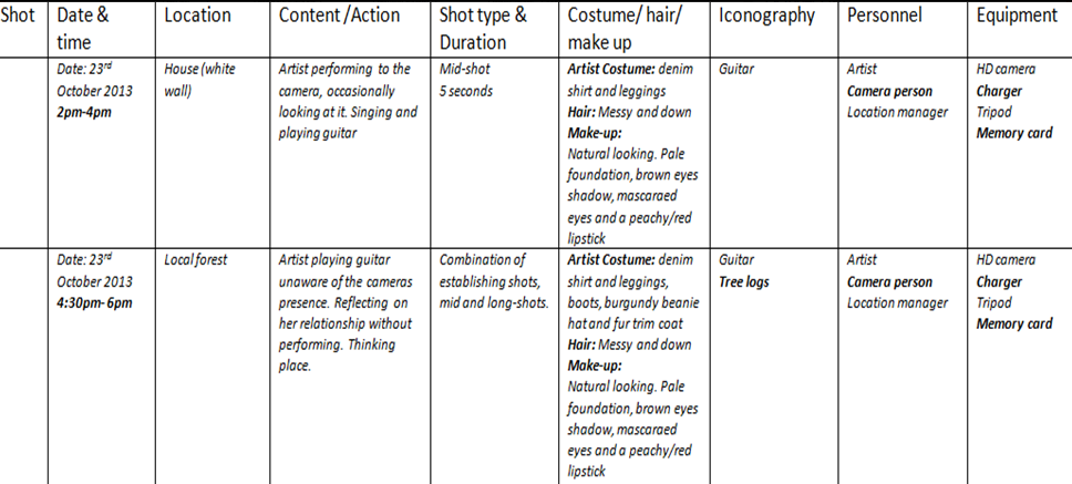
Filming Schedule


Why is a filming schedule important to have?

A filming schedule is a vital accomplice in successfully acquiring the footage that you need as it assists the efficiency in which your time is spent as the producers of your material. It is a stage of pre-planning what you will film and the equipment you may need so that this does not come as a surprise to you when actually filming you footage and therefore, will require another slotted time period to shoot again. Our filming schedule consisted of 8 columns to address each stage of planning we must carry out before actually filming. Below are each of the titles in which we addressed and why we felt they needed addressing.

Date & Time:

We pre-planned when we are going to film our footage according date, so that each member of the group was aware when we were filming, to ensure they were available and present when shooting. Also, as a result of the footage we had to film, we also had to take into account the weather as some of the filming had to be shot outside and therefore if it was scheduled to rain, we could not film as this would effect both the equipment we had and the quality of our music video. We also planned according to time so that we gave ourselves a realistic period of time to achieve what was desired and to ensure we didn't waste any time. Also, we had to take into consideration lighting and therefore had to plan times when the lighting was suitable outside. For example, if it were to get too late, ti would get too dark to film and therefore we would be unable to film.

Location:

We planned our locations in advance to ensure that all members of the group knew where they were going and therefore we did not waste time deciding on where we were going on the day of filming. If we were to have not already planned, we would have wasted time deciding on where to go. Also we had to consider the suitability of each location in regards to our music video. For example, when looking for a skate park, we were originally going to go to south bank skate park but realised that it was too crowded to create the isolated effect we wanted and therefore we went to Hainault skate park which was surrounded by fields and unpopular.

Content and Action:

We planned a rough idea as to what content we wanted to have achieved by the end of the filming process so that the outline of our narrative was being created rather the filming random footage and the story of the music video being incoherent and not understandable. In which case, we would have had to re-film what we had done in order to get the required footage, which would waste time.

Shot Type and Duration:

In our filming schedule, we planned what shot we wanted in terms of the content being filmed, mainly for two reasons; the first being that the shot was effective in creating the desire effect we wanted on the audience so that they understood the narrative i.e. when the artist is performing there will be a variation of both mid shots in order to see her playing guitar and conform to convention, as well as close ups to familiarise the herself with the audience. Secondly, the planning of the shots being used ensured that we were using a variation of shots overall, as this increases continuity of the footage and increases realism in order for the audience to relate and understand.

Costume, Hair and Make Up:

We planned each aspect of the artist's image in order to ensure that it was suitable to the footage being filmed. For example, during the performance aspect of the video the artist is much more stripped back, wearing plain clothes. Whereas during the argument scene in the skate park, she is wearing outdoor clothing to suit the scene being filmed. Also, as an Indie artist we aimed to present this effectively in order to appeal to the target audience and therefore the artist typically had; ruffled hair, black eye liner, red lipstick, denim or leather jacket and a dress with boots. Such image subverts mainstream conventions and therefore the audience can recognise the artist as being different an indie.

Iconography:

Planning iconography assisted us in being prepared as to what to take with us on set, to ensure we had all that we needed to complete filming. For example, when shooting performance we needed the guitar and therefore if we were not to have included the guitar within our filming schedule, we may have been prone to forgetting to bring it and therefore the period of time we had planned to film would have had to have been rearranged and done again. It also allowed us to keep track of whether we were conforming to convention or not in terms of iconography used in the indie genre.

Personnel:

We planned as to what positions had to be present in the filming period of each scene in order to ensure each role was being efficiently fulfilled. Although we all took turns as to the role we played, by noting down who was required to be there it ensured that we all had a chance of playing a role during the filming process as well of the post production process. It also assisted in planning travel methods, as if there was too many people required to be present at filming we would have to take the bus instead of a car, which would have had to have been organised, for example.

Equipment:

We planned the equipment we will need for filming to ensure that we remembered to bring each piece of equipment with us. Not only this, but that we had pre-organised to have permission to use the equipment as well as checking they were fully charged and working. Otherwise, this may have delayed us in carrying out our filming.


Do you follow the schedule while filming, or did you make any changes?

Overall, we typically met our filming schedule across all the aspects that we had planned in advance. However,  we did change one area, in which that was the last of the filming schedule. Instead of filming in London to do a time-lapse, we instead filming an argument in the skate park as we felt this was more effective in relation to the narrative of the music video. The skate park had been previously used to show the boyfriend's individual space and therefore by filming the argument in this location, shows how the individuals have lost themselves in each other as a result of delusion.


Risk Assessment


It is vital to complete a risk assessment previous to filming our music video in order to identify any potential hazards and in turn, discover methods to limit the chance of any potential hazards occurring. We have recognised 5 potential hazards that could occur and how we will stop them from happening so that both the safety of ourselves and others as well as are filming go according to plan. This will assist our filming as it will become more efficient, any potential hazards that could waste time or effect the quality of out filming have been dealt with before happening so that they don't happen when actually filming.


Friday, 25 October 2013

Planning Lighting and Colours

What is the purpose of lighting and colour?

Lighting in production is often used to create a certain mood for the audience to pick up on. It creates a desired atmosphere in order almost 'set the scene'. For example, low key lighting is often used in thrillers in order to hide the identity of the antagonist and therefore keep the audience in suspense as to who it is. It also creates a eerie atmosphere because it is dark, and therefore the audience cannot see very much, making them vulnerable to any sudden movements or sound in the film. Conclusively, it can be argued that lighting is significant in creating an ambience, conventionally to effect the audience in some way or another. Colour is used in production as they connote hidden meanings that subconsciously effect the audience. For example, if a person is wearing white, the audience are prone to presuming that they are innocent and pure as these are conventional connotations of the colour white in which humans are likely to associate with one another. Therefore colour is purposeful in suggesting hidden meaning which in the case of our music video, could possibly contribute to the artist representation and the narrative its self. Colour is effectively used in our music video, explained below:


What lighting will you include and why?

Light is a motif in our music video as the artist often refers to it in the lyrics of our chosen song. We have discovered that the allusion to light conveys hidden meaning when annotating the lyrics of our song, presented in the Lyrics Analysis post. The lyrics refer to different sources of light, one being the indication of sun rise in the line 'He goes out, till the lights up' suggesting that the 'light' is in fact the sun coming up and therefore, he has been out all night. We decided that to create a scene in which both the artist and boyfriend are out on a field at sunrise to show that they had been out all night. Because the sunrise is effectively to start of a new day, this could be symbolic of a new period in their lives, as if it were a 'new start'. However, the lyrics state that his behaviour continues and therefore this portrays the endless cycle of their relationship as there is always a new day, but nothing ever changes for them to have a 'new start'. Therefore this use of light conveys to the audience that the relationship in non-progressive, a deeper understanding than what the lyrics provide alone.

Another source of light we aim to use, is fireworks and sparklers. In the post Planning Setting and Iconography I have spoke about the desired effect in which these pieces of iconography are aimed to have create. The fireworks will be used to suggest chaos, the couple being out of control in terms of reality, for they are unaware of such thing. The fireworks will be used in a field so that it is emphasised that such chaos and lack of self control is cut of from the real world for they have isolated themselves through delusion. In turn, this source of light will present the relationship as destructive and wild, again providing the audience with a deeper understanding of the song itself. Further explanation regarding our light motif can be found in the post above.


What colour will you use and why?

During the firework scene, we plan to use red flares in the background of the scene so that they are visible but not completely focused on. We decided on the colour red as this colour in particular has many ambiguous connotations that allow the audience to decide for themselves as to which they choose. The colour red can be associated with feelings such as love; in which this could be portray the viewpoint of the artist, as in the beginning of the video she believes that she does in fact love her boyfriend. However, this colour also connotes emotions such as anger, can be used as a warning for danger, as well as being used to inform people to stop. All of the previous connotations are relevant to the portrayal of the relationship between the two individuals as the artist does become angry with her boyfriend, he is dangerous to be around and in the end, the artist does want to stop the relationship and move on.

Costumes of the characters will vary in colour an therefore portraying their diversity as the contrast of colours suggest an ever changing personality, relevant to the boyfriend in particular. DONT KNOW WHAT TO WRITEEEEEEEEEEEEEEE


How is your lighting and colour conventional to your music genre?

Sources of light that are naturalistic such as the sunset are conventional to the indie genre as it is simplistic. The indie genre often consists of natural and simple content as this contributes to their laid back image that can be easily related to by their target audience. However, sources of light such as fireworks and sparklers subvert the indie genre, as they aren't natural can arguably be interpreted as contrasting to simplistic. Also, as we are using these to convey the hidden meaning behind the lyrics,  this also subverts the indie genre as artists typically focus on the music itself rather than its visual understanding. We have chosen to challenge such convention in order for the audience to remain engaged in the music video, as it provides an unpredictable indie music video because it doesn't completely conform to the generic conventions.


How does it build a relationship with your target audience?

The light and colours are symbolic of the hidden meaning of the song and therefore provides the audience with a deeper understanding of the portrayal regarding the relationship the artist depicts. This encourages the audience to increasingly connect with the song as they understand the meaning in more depth, therefore understanding the artist in more depth also, as they are familiar with how she is feeling, what she is going through etc etc. In turn, the lighting and colour used in the video allows the audience to build a relationship with the song and artist. Not only this, but the lighting and colour are visually appealing and therefore engage the audience in watching it, as it becomes appealing for them to watch.


This post demonstrates proficient planning techniques. You have explained the reasons for selecting your lighting and colour that you wish to include, by focusing on the effect each will create. 

Now you need to ensure that you have related your points back to the codes and conventions of an indie music genre. Also aim to include images to support the points that you have made.

Finally, read over the introduction to this post, as you have confused yourself with the purpose of lighting and the effect it creates.